The real campaign for the British general election is now in full swing and there’s a new poll every hour predicting a lead of one or the other party. Now polls change all the time, and most of the time they are wrong. I don’t care that much about how many votes Labour gets today as compared to yesterday. What I’m interested in, however, is the broader dynamic of representation across income groups and social classes, which tend to be fairly stable. Last weekend I have been playing with some data from recent waves of the British Election Study and drawn some graphs about the appeal of the different parties across income groups, and the composition of their electorate by income group. A few interesting facts:
1. Income matters a lot more for the Tories and UKIP than for Labour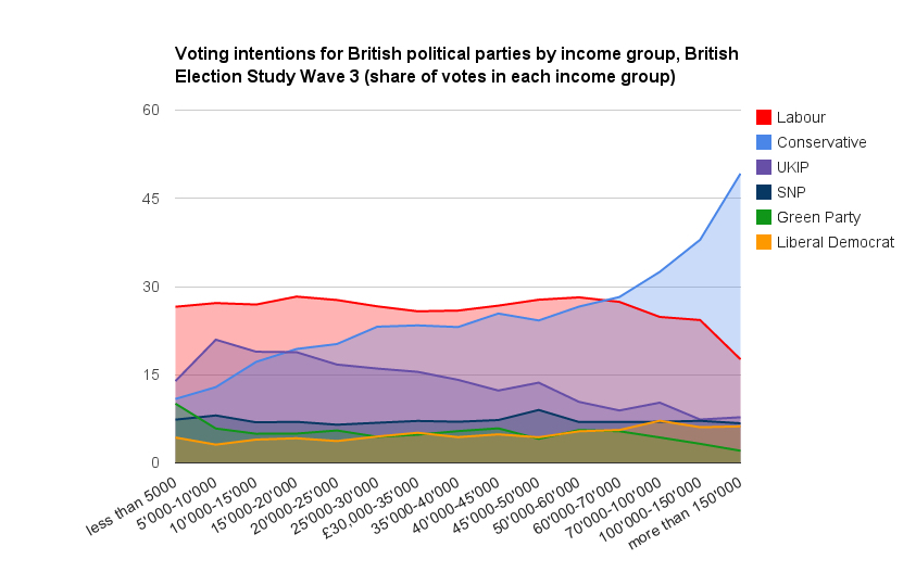
The Graph above (large interactive version here) shows the share of party support among income groups (yearly gross household income) in Wave 3 of the British Election Study. The lines are quite different for the big parties: support for Labour is fairly stable across income groups, and only drops among the rich, from 60’000k onwards. Labour looks like a cross-class party where increases in income do not significantly raise or decrease support, at least until a certain threshold. The picture is very different for the Tories, where there is a much larger difference in support between voters across levels of the income distribution. Poor voters are much less likely to vote Tory, while rich voters are much more likely to do so. In some way, this can explain the policies that the government is pushing through, namely cutting benefits at the bottom (who do not vote Tory anyway) to lower the fiscal burden at the top (who do disproportionately vote Tory). Interestingly UKIP has a line going in the opposite direction: UKIP support declines steadily as income increases. It has the working-class profile that Labour doesn’t (no longer) have. Note the high support for the Greens among voters a the very bottom of the distribution, which may be due to the high proportion of students.
The second graph (below and interactive here) shows the difference in support between the different income groups and the mean. What the graph means is that the difference in Tory support between people with an household income of 150’000 pounds and higher and the whole electorate is 120% (this is a difference; they are 2.2 times more likely to vote Tory than average). Once again, the trend described above is visible: income groups are very polarised in Tory (and UKIP, which is the mirror image) support, while the difference is small for Labour

The graphs above don’t tell you how important these different income groups are electorally. The very rich vote to a much larger extent for the Tories, but they may be a small minority. The graph below shows the size of each income group in proportion to the overall electorate. The larger income groups are located between 10’000 and 40’000 pounds a year. In all of these, Labour wins, while the Tories clearly dominate in the higher ones, but they are much smaller.
2. Different compositions in the electorate create different policy incentives
This is not very surprising but it is nice to see in the data. In the graph below I have divided the voters of the main parties in three income groups of similar size in the overall electorate (I have recoded the categories above). It could represent the working class, the middle class and the upper class. When parties devise policies, they seek to forge alliances between these different groups, which is likely to be at the expense of one group (e.g the rich want low taxes and the poor want more spending, but it is difficult to do both). Within Labour, the lower class is the biggest, while the upper and middle class are close and equally sized. Within the Tories, the upper class is by far the biggest, while the lower class is the smallest. Internally, an alliance between middle and upper class has a clear majority within the Conservatives, while this alliance fails to do so within Labour. Instead, an alliance between lower and middle class has a majority (last graph). In a very stylized way, this internal balance of power explains fairly well the policies that the different parties offer to voters.


Leave a comment