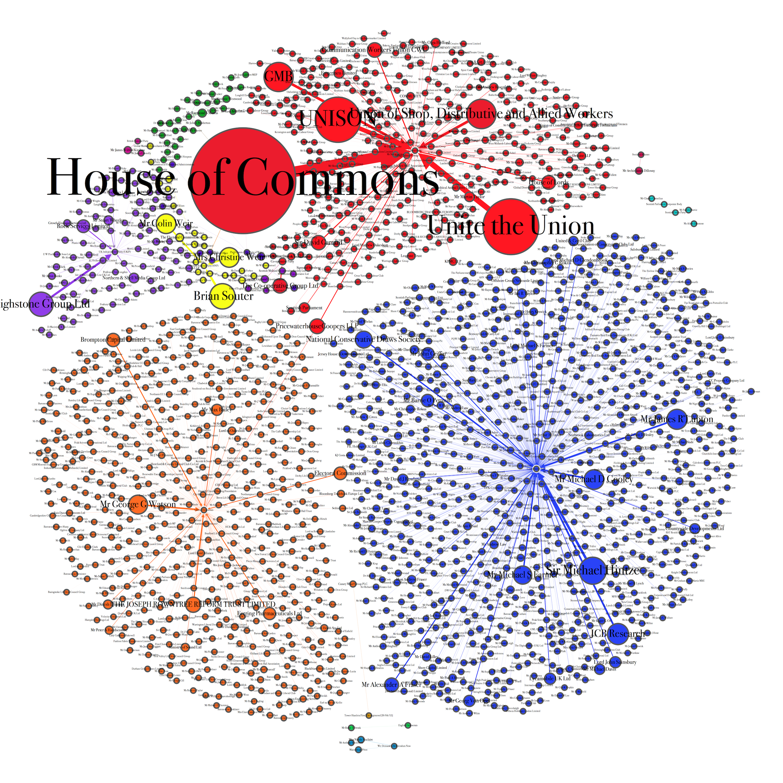
This is a map of donations to UK political parties in Q3 2015 using openly available data from the electoral commission. The size of the nodes and arrows corresponds to the size of donations; nodes are coloured by party (Red for Labour, Blue for the Tories, Orange for Libdems, Purple for UKIP, Yellow for SNP). There are quite clear differences in the structure of funding between the main parties: Labour has a few large donors, namely the unions and the House of Commons via short money. The Conservatives have a much more scattered structure of funding, but some of it comes through collective structure (e.g the Conservative draws society) that enables donors to conceal their identity. Interesting factoid: Colin and Christine Weir, the two largest benefactors of the SNP after Stagecoach’s Brian Soulter, have won 155 mio at the Euromillion lottery.


Leave a comment