Mapping Preferences over Brexit in the House of Commons

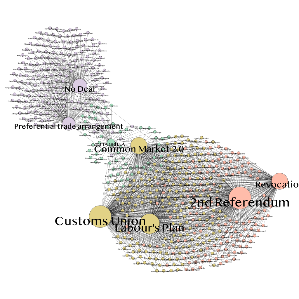
In the graph above (zoomable version here), I have mapped the votes of British MPs in the 8 options given to them on March 27 (a couple of hours ago) in indicative votes. This is a 2-mode network linking MPs and options for Brexit. The network graph shows how different options are related to each other: they are closer if a greater number of MPs have voted for them. Their size shows the number of favourable votes for each option (none of them obtained a majority. The graph show the high level of polarisation over these different options, with two clear poles: the “Hard Brexit” pole with a number of MPs for whom the only option is No Deal, or a preferential trade arrangement, and the Soft Brexit-No Brexit pole, linking the Customs Union, Labour’s Plan and a Second Referendum/Revocation of article 50. The EFTA/EEA and Common Market 2.0 options link the two poles, but there seems to be very few MPS that could be rallied in the middle.

7 responses to “Mapping Preferences over Brexit in the House of Commons”

  1. Hello,
    Could you please share what visualization software you used to map the votes? It does not look like Palladio. Is it Gephi or something else?
    Thank you very much for your answer,
    Svetlana

  2. This might be more interesting if you didn’t plot every MP, but rather grouped MPs according to which set of indicative votes they voted for. Plot one node for each group, sized according to the group. Far fewer edges. It should make it easy to see what might happen if nodes coalesce (around compromises).

  3. Sorry if this a trivial point, but how is the individual MP’s position determined on the graph? Is each one placed so that the sum of the length of the lines connecting them with the options they voted for is smallest, or is there another logic at work?

  4. That is great, thank you so much!

    Would it be useful to add Theresa Mays deal and the people who voted for it as the 9th node?

Leave a comment